Card
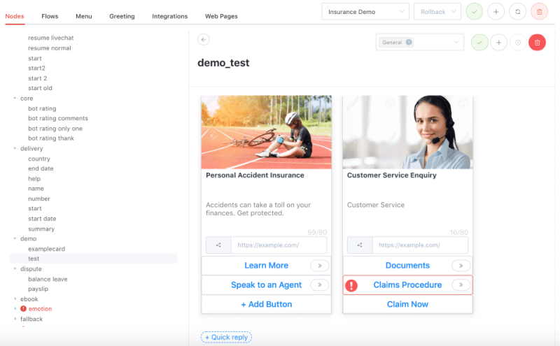
A card response provides a more contextual response through the use of images, description, link, buttons and quick replies.
How is this useful?
Cards can be used to showcase products or services to your end-users, and provide end-users with more information at a single glance.
You may create a card carousel by adding multiple cards to a content node.

How do I add a card to my content node?
- After a content node has been created, click on ‘+’, followed by ‘Card’ to add a card.
- Click on Add Image, and enter the URL of the image that you want to show.
- Enter the title of the card (maximum 80 characters). The title used should be a representative title, and will be displayed in bold characters.
- Add a short description (maximum 80 characters)
- Add a link.
- If you would like to edit the title, short description and link, simply click on the respective text boxes to edit them.
- You can add multiple cards, and your users will be able to scroll horizontally to view the card carousel.
- Click on the tick on the header bar to save the node.


